
Moxie Rebranding
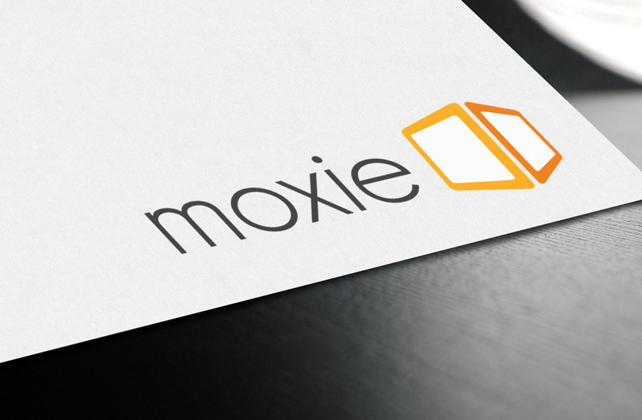
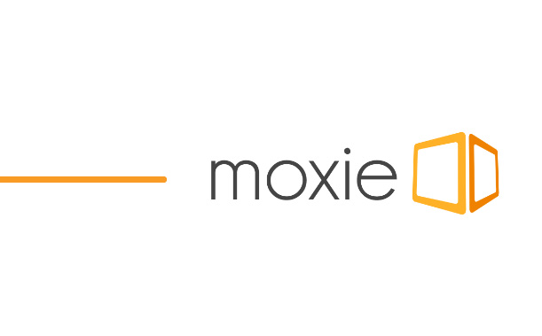
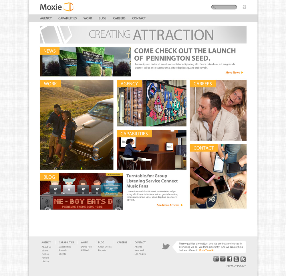
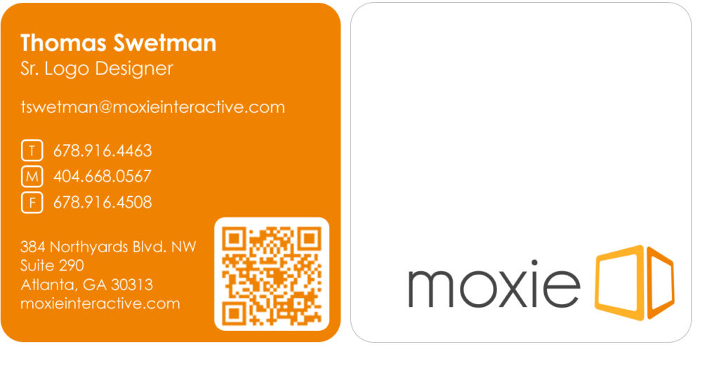
In 2011 Moxie Interactive wanted to rebrand their company’s look and feel by giving the company’s logo a face-lift. The challenge was to represent all of Moxie’s traits in one single bold and memorable symbol. The design was created around the idea of a box built from flat panel display screens. The final logo unveiled a clean and modern look for Moxie. The website was a complete update bringing in responsive design and a showed off more of the fun feel at Moxie.
Related items

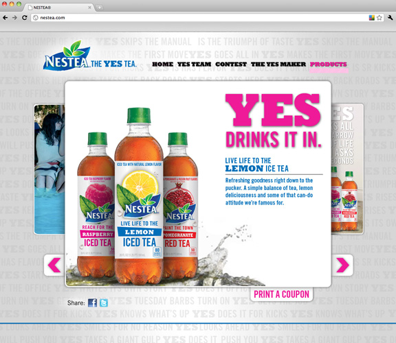
Nestea – The YES Tea
Nestea asked us to help them with their re-brand by ensuring everyone's YES moment was…
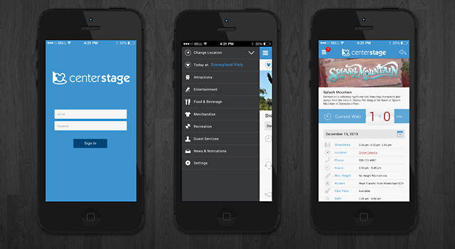
Disney Center Stage
Disney wanted to bring the magic to their employees on their iPhones. We designed an…

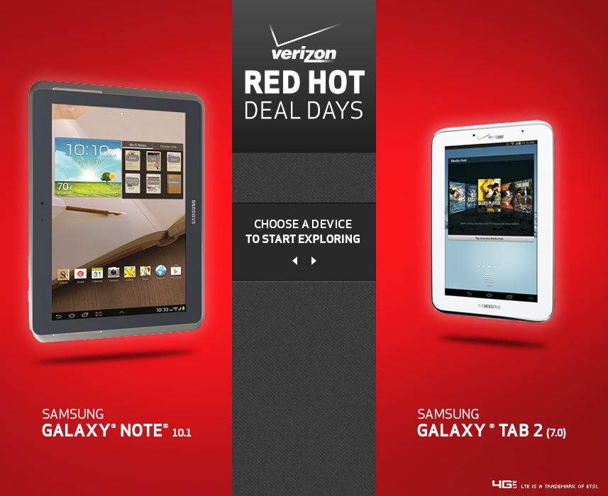
Verizon Red Hot Deal Days
Back to School Sale for Verizon is many large sale days. Stretching across multiple outlets,…